- Illustrator
- InDesign
- Maya
Sep 1, 2015
Introduction
In one impressive example of the impact of design, removing a single field from the Expedia.com check-out form boosted sales by 12 million dollars. If a simple UI decision can do that for e-commerce, what can it do for learning? When designing interfaces for learning, we consider usability and the user experience, but we also need to keep in mind that the goals of the learner are significantly different from a consumer: a learner is seeking to transform herself. The field of Instructional Design (ID) is devoted to crafting educational experiences based on learning science research, and if you’re developing educational content, consulting with an instructional designer would be beneficial. If you don't have access to an ID specialist however, there are still simple things you can do to enhance the learning experience.
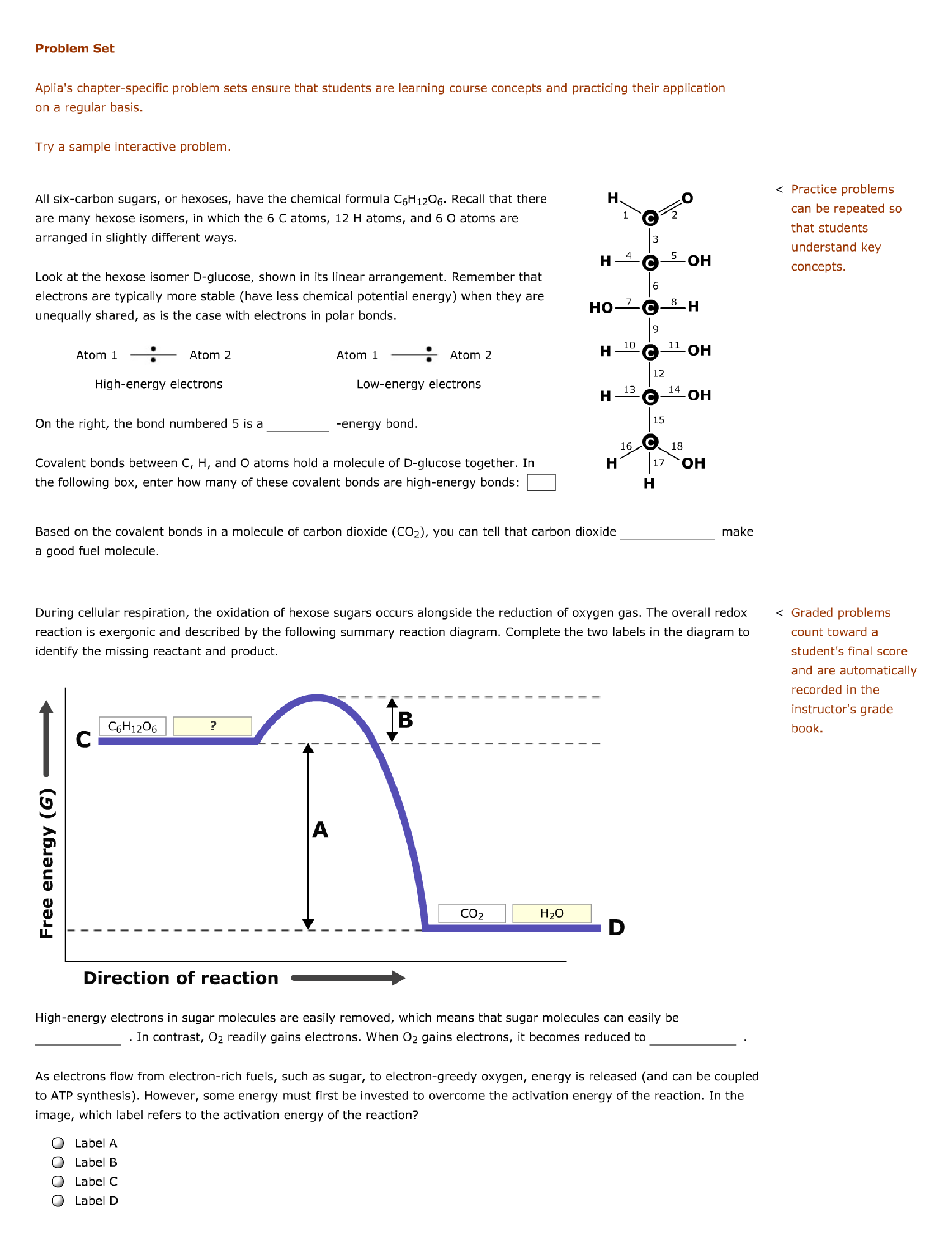
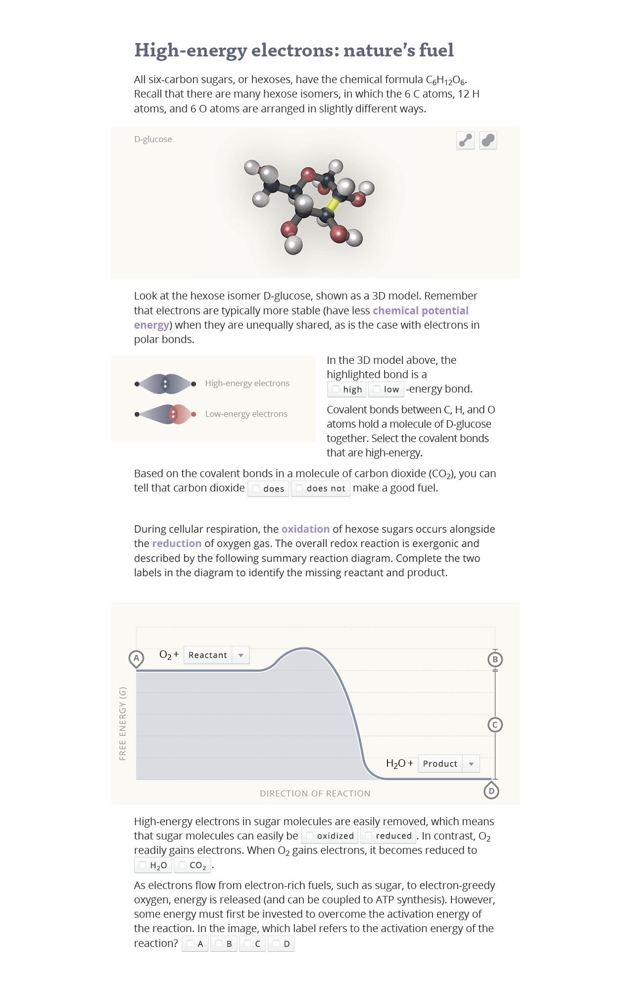
Figure 1 shows an image from Aplia, an online learning resource. Figure 2 is my unsolicited redesign based on simple advice from “Don’t Make Me Think”, “Interface design for learning”, and other books.
Make it easy to use
Every time the student gets confused by the learning interface it undermines their sense of control and distracts them from the content. My approach to the redesign was first to identify and remove these "points of friction". A point of friction was taken to be any question that – not related to the content – that occurred to me as I went through the learning module. (A better methodology would be to have real students record their own questions.) Here are the questions (Q) I had, and how I addressed (A) them in the redesign:
- What are the main topics here?
- Create a style guide and establish consistent visual hierarchy with typography and colour. Highlight key terms.
- Why is electron sharing shown like this?
- Prefer using relevant images over words. (A well designed educational graphic can extend the brain’s ability to reason about the content but a poorly designed one will hurt learning.)
- Where is bond number 5?
- Make it easier to visually link the question, the subject of the question, and the method of response.
- How am I supposed to read this style of molecular representation again?
- Unless it's part of the learning objective, prefer a more denotative molecular representation over abstract (symbolic) ones, especially for lower level/non-majors courses. Replace the Fischer representation with a 3D rotatable ball-and-stick model.
- What if I use the wrong keyword even though I’m technically correct in, e.g. carbon dioxide ___ make a good fuel?
- Clarify the actionable choices.
- How do I complete the graph labels?
- Make obvious what’s interactive and how to interact with it. Making a button look like a button increases engagement.
Make it look easy to use too
If something looks like it’s going to be difficult to use it won’t be used. Attractive interfaces are easier use than less attractive ones even if they are functionally equivalent. This is because aesthetics impact mood and disposition towards tackling a problem, (the “aesthetic-usability effect”). Pleasing and consistent styling can make the learner feel smarter and more in control by helping them immediately ‘get' what they are supposed to do.
A style guide (Figure 3) can not only define the visual hierarchy, but also establish aesthetic and mood through layout, colour, and typographic treatment. Since we are less receptive to challenges and less able to think creatively when we are anxious or stressed, the style guide elements for the redesign were selected to foster a friendly and calming mood.
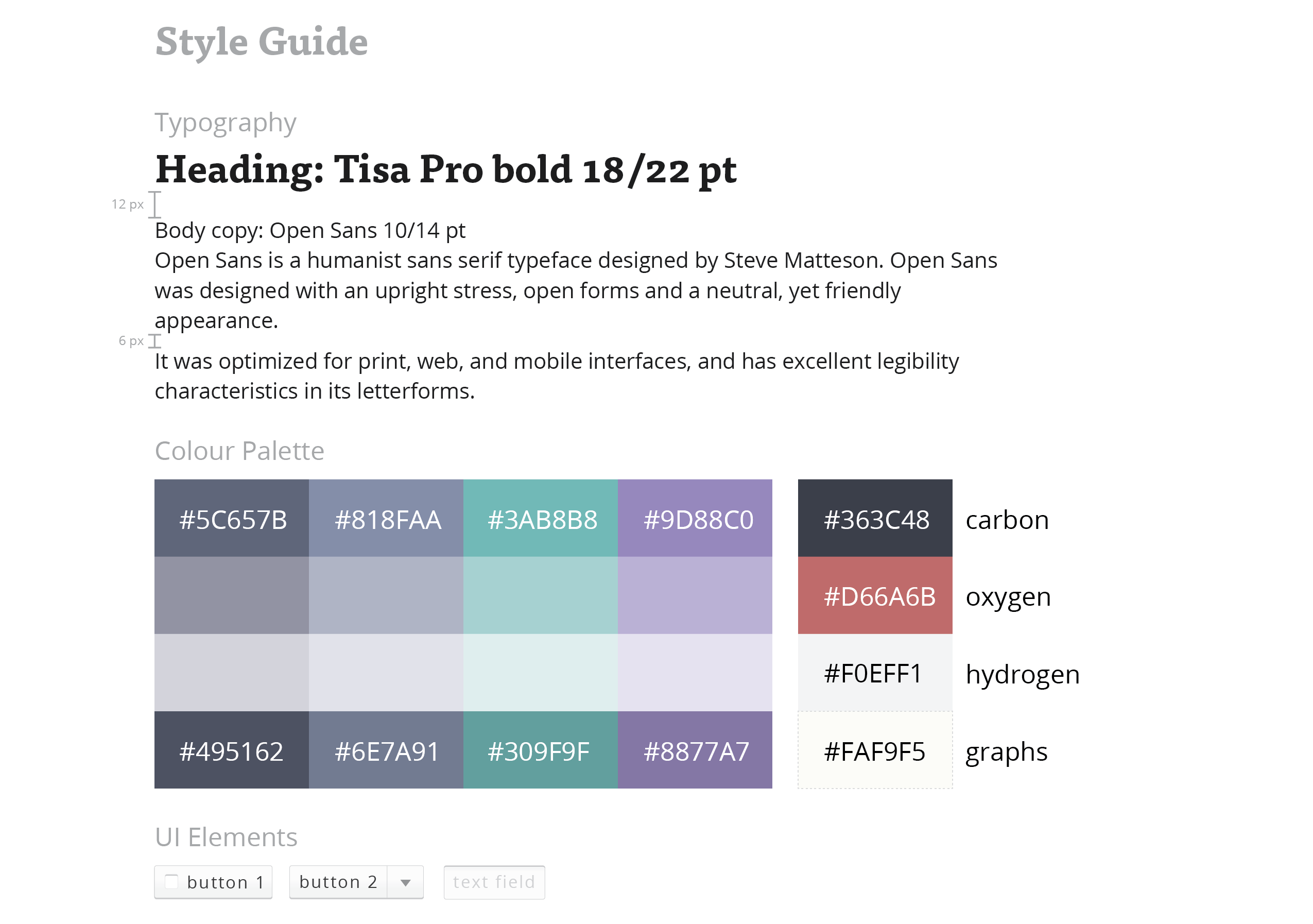
Open Sans and Tisa Pro, friendly typefaces designed for legibility and comfortable screen reading were chosen. A line length of 65-75 is used, which is known to be a comfortable reading length. Consistent white space is introduced to help break the page layout into chunks. Words relevant to the learning objectives are highlighted to help identify at-a-glance what the key topics are and where they are discussed. Cooler colours are selected to create an overall pallete that is receding and calming:
Conclusion
Addressing points of friction in the interface helps to ‘make it easy’. More challenging would be to ‘make it fun’ – enhancing engagement by designing for motivation. This would likely require a larger-scale redesigning of the content and application framework. For instance, we would want to tap into key learning motivators such as purpose, by connecting the new knowledge to real-world applications; autonomy, by providing a sense control over the learning experience by creating more actionable content that modify results; and mastery, by showing progress along a learning path.