- Illustrator
- Photoshop
- InDesign
- Maya
April 1, 2015
Brief
Create an editorial cover illustration to accompany the journal article, "Stepwise growth of surface-grafted DNA nanotubes visualized at the single molecule level", by Dr. Gonzalo Cosa, chemistry professor at McGill University. The paper had been accepted to Nature Chemistry and the illustration would be entered in the competition for the cover of the April 2014 issue of Nature Chemistry.
Approach
I analyzed past successful Nature Chemistry cover illustrations and proposed two treatments. I then met with the client to get feedback and, following three revision cycles, the illustration submitted to Nature Chemistry.
Analysis
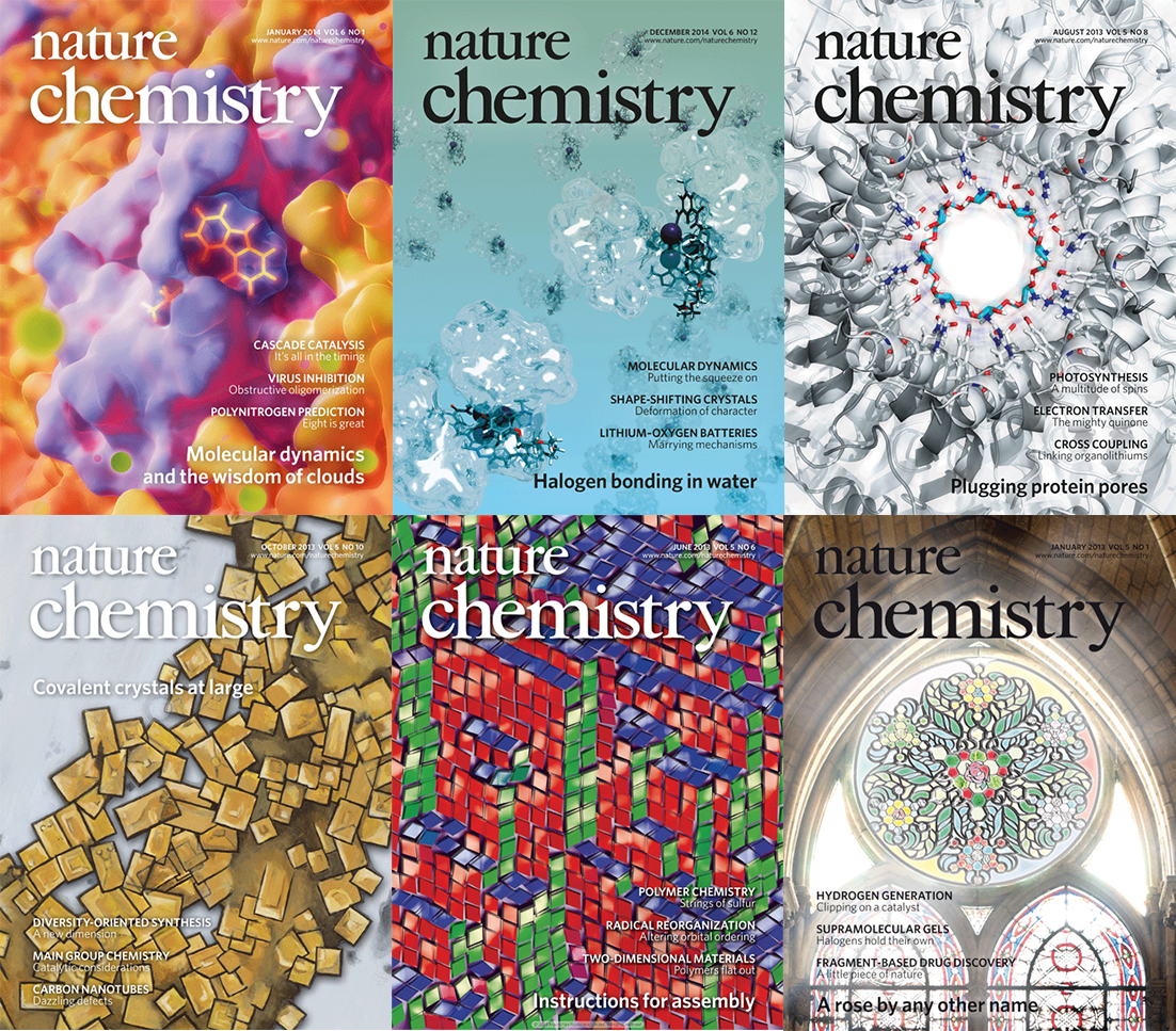
Nature Chemistry covers from the past two years (25 issues, including January 2015), fall into two main categories: molecular visualizations (10/25, Figure 1 top), and artistic interpretations of molecular structure (9/25, Figure 1 bottom). Two lesser represented categories are microscopy photos (4/25) and visual metaphors (2/25).
The uneven distribution is likely more of a reflection of the journal's subject matter, which tends to deal with the submicroscopic level, than an indication of general style preference by the journal's editors (photos are much more common on Nature covers for instance). However, it does suggest that the two main categories are safe bets. In addition, Nature Chemistry covers typically consist of a single, "hero image" devoid of callouts, labels or schematic drawings. As stated in Making your mark on the journal cover, "Throwing together composite images with lots of different objects styled in different ways on a somewhat arbitrary background just doesn't do it for us. … It really does come down to what we judge to be the most striking image."
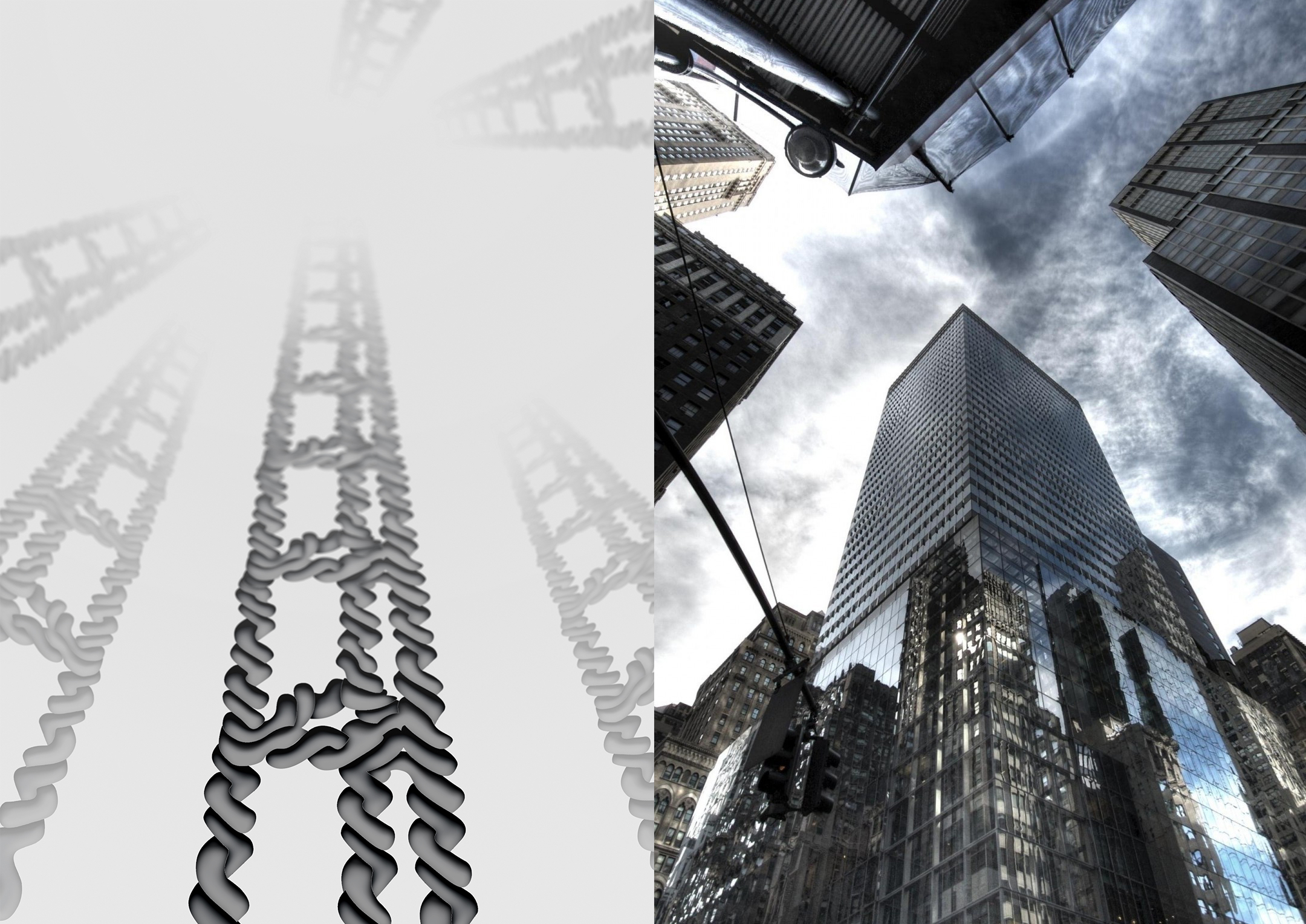
Treatment 1: Classic molecular visualization
The DNA nanotubes are viewed from below in 1-point perspective, i.e. the viewer is on the ground, looking up (Figure 2). The illustration emphasizes the rigid structure of the nanotubes. The main focus is on the largest nanotube in the centre of the page, its ladder-like appearance serving as a visual metaphor for advancement. The metaphor could be emphasized by giving the molecular representation a wood "skin" similar to a wood ladder. A 'realistic' molecular surface or CPK representation of the DNA nanotube is envisioned.
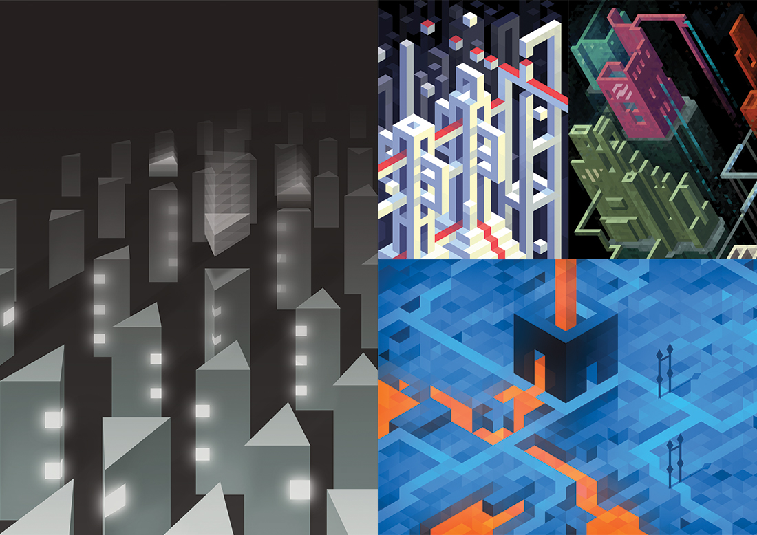
Treatment 2: Artistic interpretations of molecular structures
DNA nanotubes are viewed from above in stereoscopic perspective (Figure 3 left). The nanotube structure is simplified into triangular prisms and small subunits fly in from above, adding to the growing structures. Some subunits glow (these are fluorescently labelled rigidifying structures). The illustration emphasizes the modular, controlled growth of custom nanotubes on a solid support. The ground plane could be made to glow to suggest the TIRF microscope setup. The 2D illustration will be created with Hexels, a grid-based digital painting program in order to achieve the popular, pixel art style (Figure 1 right).
Revision 1
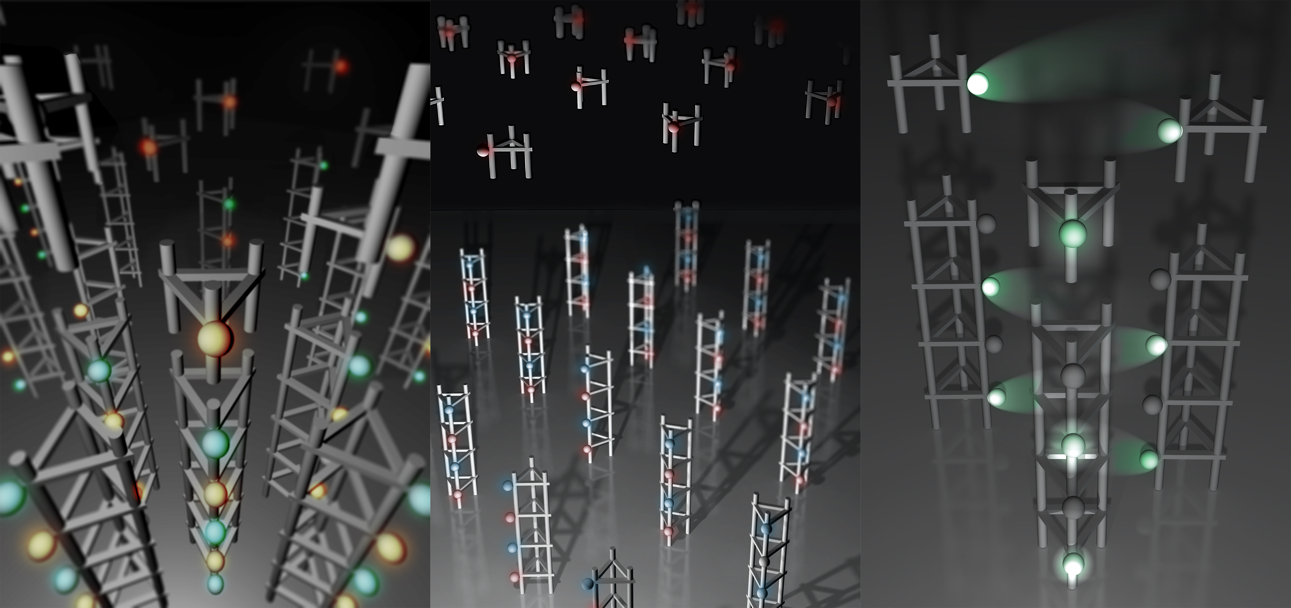
Client feedback: Use the nanotube molecular structures in Treatment 1, not the simplified prisms in Treatment 2; however, Treatment 1 does not tell the solid-phase synthesis story well enough. Consider changing the perspective of Treatment 1 to a top-down view, similar to Treatment 2 and have rungs incoming. We also want to highlight the segmented nature of the DNA ladders, e.g. with alternating colour or some other technique. The fluorescent tags should be spaced regularly, and always on the same side of the nanotube.
Solution: I tried three different sketches (Figure 4) with top-down views of the nanotubes using simplified structures. To highlight the alternating rung types, either alternate the colour of the fluorescent dye, or omit the rung colour could be alternated instead. In all Figure 4 sketches the former is explored. The type of light emitted by the dye could either be a glow or a spotlight. The former may be preferable if scene is already visually "busy".
Revision 2
Client feedback: We want to convey both the rigidity and flexibility of the nanotubes, similar to that in fiber optic cable images, by making nanotubes longer (length of one side is 6.8nm, and a 20mer nanotube is ~480nm in length) and curving. Try red and green colours to differentiate the rungs. Omit individual rungs flying in. Show light shining up from the ground by the TIRF microscope.
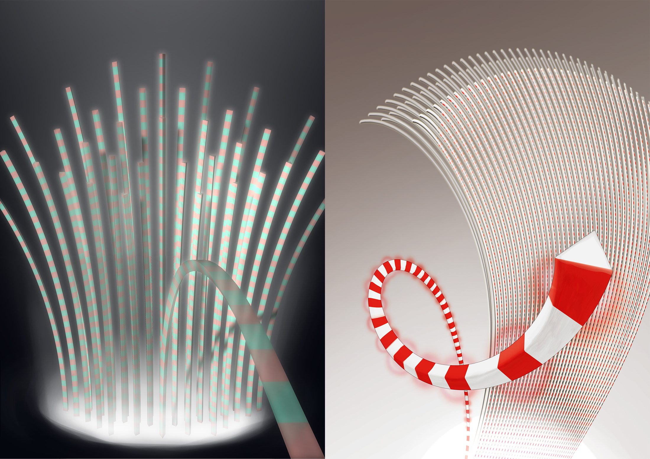
Revision 3
Client feedback: Nanotubes should be dispersed across the image, but only the fluorophores within the light cube glow. The molecular structure of the single nanotube that comes out towards you should be clear. The material of the nanotubes further back should appear more organic. The glowing red and green regions should be interspersed by non-glowing regions.
Conclusion
The final cover illustration (Figure 6) was selected for the cover of the Nature Chemistry, April 2015 issue.